
Punch-drunk on color: Book edition
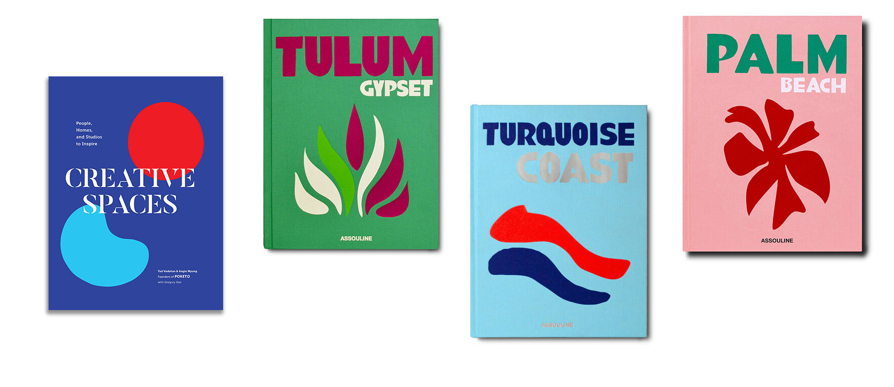
Poketo’s Creative Spaces, Assouline- Tulum, Turquoise Coast, Palm Beach
Punchy hues in complimentary colors have been making a splash in the literary world and with good reason. The minimal design let’s the colors do what they do best, evoke curiosity and a sense of joy.
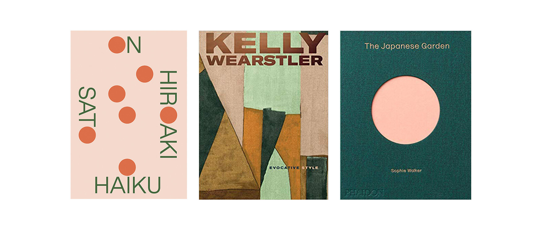
Hiraokai Haiku, Kelly Wearstler- Evocative Style, The Japanese Garden
A few of my favorite covers lately have been sharing in my love for a green and blushy pinks color combination. This gorgeous color pairing is reminiscent of spring in bloom with a element of opulence.

A textural repeat print as seen on “Mia Couto’s , Woman of the Ashes gives off a controlled chaos-minimal layout that creates some depth for the fresh lemon yellow typography. Sam Graham-Feben new novel GREEN, adds a few simple splashes of colors to a rather simple organic sketch for an 80’s post-modernism vibe.

Typography and punchy colors can really go along way and one could easily make the assumption that designing a minimal book cover is as simple as it looks. But, looks can definitely be deceiving. A great designer will never underestimate the power of a exquisite type-font and knows that the wrong font can indeed completely throw off the entire look of a design. The same can be said about color combinations. It’s all about understanding the psychology of color and the storyline that a simple type-font can convey when properly considered.
If you are planning a book launch, I salute you and hope these examples offered you a dose of inspiration. If you need some design direction, feel free to reach out!
- Claudia